Title of publication - written in big, bold letters to state the programme. Made more appealing through the use of font colours, too. The Colour scheme - as mentioned before, fonts have bright, vibrant colours that possibly look like fireworks, and this is very well fitting as we associate this with a "festival. The Language - as mentioned on the convention notes, it is 'economical' because it states "in partnership with" "American Express". Very snappy too as it states it's business and it's business, only. The Date - states the film festival's date, and is clearly written
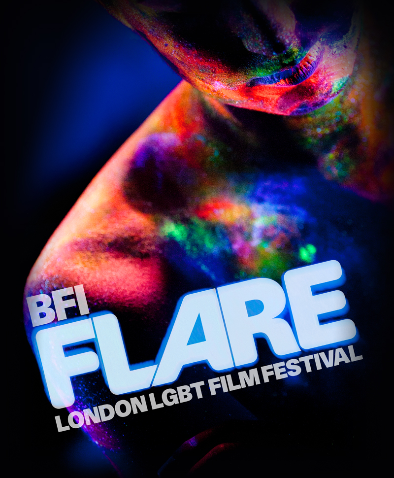
BFI leaflet of 2015 unquestionably has tried different things with the utilization of various hues a great deal, and the shading plan is what they're typically known not. However this handout specifically from them has rather utilized models that has the brilliant plan connected
- Black and white imaegs
- images with colour
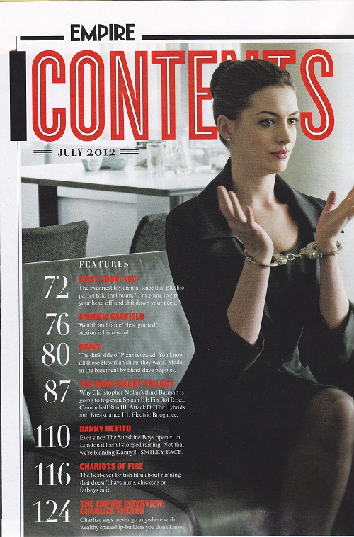
- white background on left side
- big and bold page number

- white background and black text
- visible
- uses bright colours
- uses pictures on both pages
3)

- uses dark colours
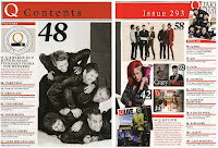
- only one main image in the centre of the contents page
- provides page numbers
- bold and big title
4)
- One central image
- shows all page number
- contents page heading big and bold
5)

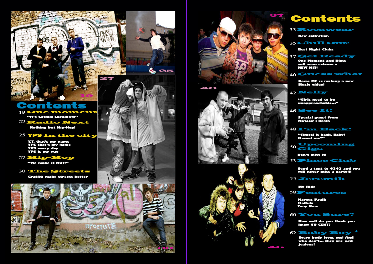
- contents page title covers both pages and its bold
- many small images scattered around the double page
- use of bright colours
- small black text

Uses dark toned colours, doesn't seem like a happy and exciting

Using the dafont website am going to try and find the best suitable font to fit perfectly with my chosen theme.
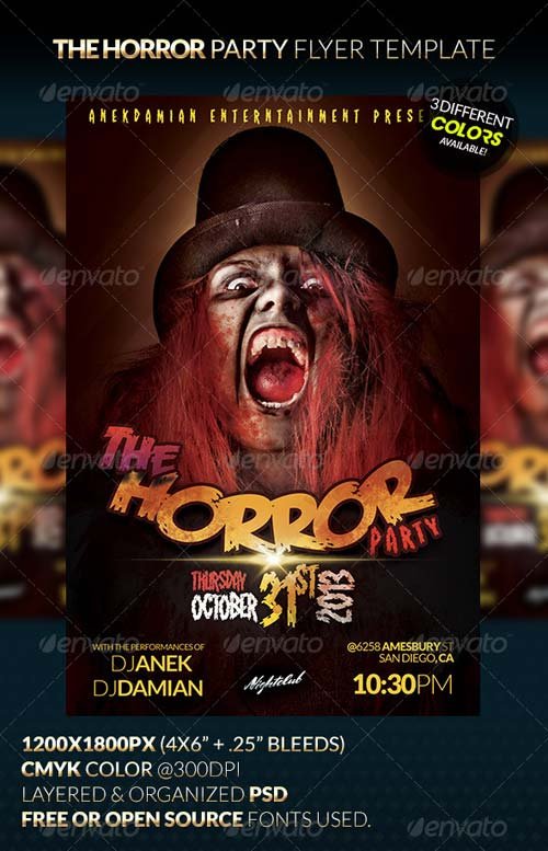
This print uses dark colours which fits perfectly with Horror. I have few dark toned pictures so i think this is really helpful.

the use of the exaggeration is really good as it would attract the audiences and this is something I plan to use in my print. Black and white colour scheme and only employs two images placed at the top and bottom. I t uses lots of texts around the page.

Black and white colour scheme and only employs two images placed at the top and bottom. I t uses lots of texts around the page.
No comments:
Post a Comment